Presenting Data Insights
Structure and deliver clear data analysis
Learn how to distill data analysis down into concise recommendations and deliver takeaways in clear, succinct language that lands with conviction.


Think back to the last time someone walked your team through a wall of numbers. The slide goes up, dense with rows and labels, and it’s gone again in five seconds, right after the next click. Everyone nods. No one is quite sure what they just agreed to. The data was probably sound, but the way they displayed it wasn’t.
It can be tricky to display data in presentations because different rules apply in different contexts. A sales director presenting financial projections to a field team wouldn’t visualize the numbers the same way a CMO would when making the case for a marketing budget to leadership.
So how do you make the right choices for your situation? Before you display data, ask yourself these five questions:
Displaying data well in a presentation comes down to three things: show the one conclusion you want your audience to reach, choose a chart that emphasizes it, and use color to send the eye straight there. These five questions walk you through each one.
Context plays a huge role in how best to present data. When presenting data, show the conclusions you’ve drawn, not all the details that led you to those conclusions.

Because your slides will be up for only a few seconds, your audience will need to process them quickly. People won’t have time to chew on a lot of complex information, and they’re not likely to run up to the wall for a closer look at the numbers.
So, think in broad strokes when you’re putting your charts together for your data presentation:
Those are the sorts of questions to answer when you are thinking about how to present data in presentations.
Here is one of the best ways to present data:
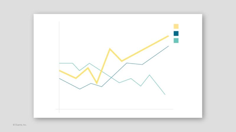
And such should provide context, but don’t let them compete with your data. The best way to present data like this is to use a light neutral color, such as gray, for these elements so they’ll recede into the background, and then plot your data in a slightly stronger neutral color. Finally, use a bright color to emphasize the point you’re making, as in this example:
If you are circulating data, a data presentation might not be the best medium. It’s fine to display more detail in documents or in slide decks that you email rather than present data. (We call these Slidedocs®.) Readers can study them at their own pace — examine the axes, the legends, the layers — and draw their own conclusions from your body of work. Still, you don’t want to overwhelm them, especially since they won’t have you there in person to explain what your main points are. Use white space, section heads, and a clear hierarchy of visual elements to help your readers navigate dense content and guide them to key pieces of data.
An easy way to start this is to download our free Slidedocs® templates. You can easily build your own visually digestible, data-heavy documents using prebuilt Microsoft PowerPoint templates to get you started. It’s one of the best ways to present data in PowerPpoint.
When you think about presenting data in PowerPoint, one of the first choices is to decide on the type of chart you want to use for your data presentation. Remember, when you choose how to visualize the data, you’re deciding what type of relationship you want to emphasize. Take a look at this chart, which shows the breakdown of an investment portfolio:
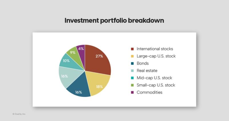
In the pie, it’s clear that this person holds a number of investments in different areas — but that’s about all you see.
Here is the same data, but now displayed in a bar chart:
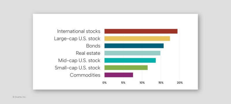
Now it’s much easier to discern how much is invested in each category. If your focus is on comparing categories, the bar chart is the better choice. Meanwhile, a pie chart would be more useful if you were trying to make the point that a single investment made up a significant portion of the portfolio.
At the end of the day, it all comes down to the story you are trying to tell with your data presentation. Another easy way to make your charts more effective is to download our free Chart annotation toolkit. It has great expert examples and templates for getting the most out of every chart, every time.

Say you’re walking your team through European sales. You could open with the full table:

Project that for five seconds and your audience is stuck squinting at heavy gridlines that give every cell equal weight. It’s hard to tell where the eye should go, which direction to read, or what conclusion to draw. The Grand Total line stands out, but that’s rarely the point you came to make.
Now say you’ve identified three business units with real potential for sustained growth. Drop the dense matrix, connect only the key numbers to a pie with leader lines, and the clutter falls away. Render the important slices in color with their annotations in large blue type, and let the rest recede in neutral grays:
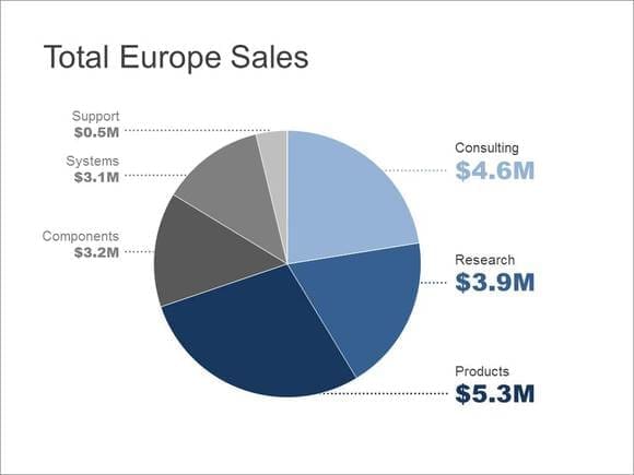
Pie charts get tricky when segments are close in size, since they’re hard to tell apart at a glance. When that happens, show the same data in a linear way. This bar chart draws attention to the poorest-performing unit, a point that got lost in the pie:
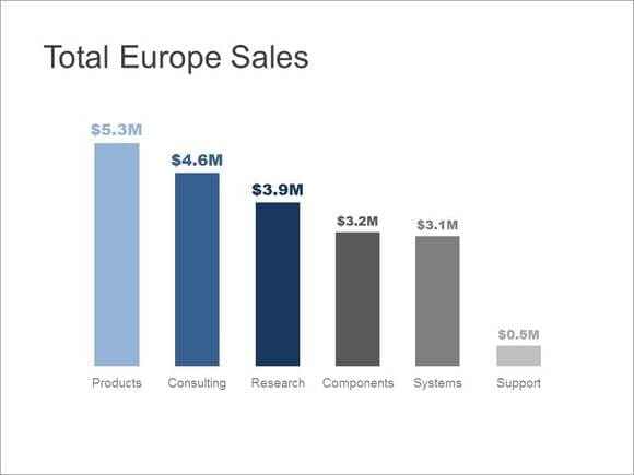
Same numbers, three different stories. The format you choose decides which one your audience carries out of the room.
Whether you’re presenting or circulating your charts, you need to highlight the most important items to ensure that your audience can follow your train of thought and focus on the right elements. For example, this chart is difficult to interpret because all the information is displayed with equal visual value:
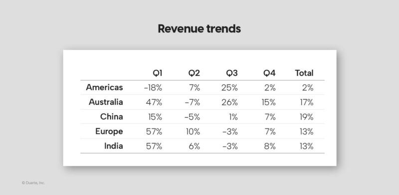
Are we comparing regions? Quarters? Positive versus negative numbers? It’s difficult to determine what matters most. By adding color when presenting data, you can draw the eye to specific areas:
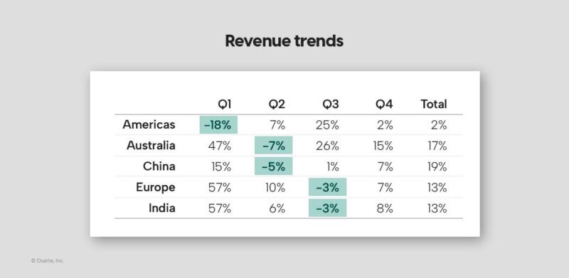
Now you are telling your audience what they should be focusing on, when, and in which regions revenue dropped.
Sometimes less is more, especially when it comes to a data presentation. Using a lot of crazy colors, extra labels, and fancy effects won’t captivate an audience. That kind of visual clutter dilutes the information and can even misrepresent it. Consider this chart:
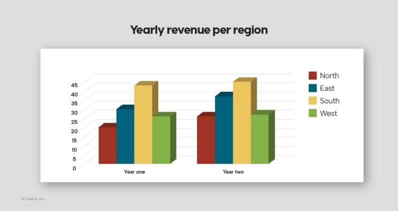
Can you figure out the northern territory’s revenue for year one? Is it 17? Or maybe 19? The way some programs create 3D charts can lead one to think that the bar in question is well below 20. However, the data behind the chart actually says that the bar represents 20.4 units.
You can see that if you look at the chart in a very specific way, but it’s difficult to tell which way that should be — even with plenty of time to scrutinize it.
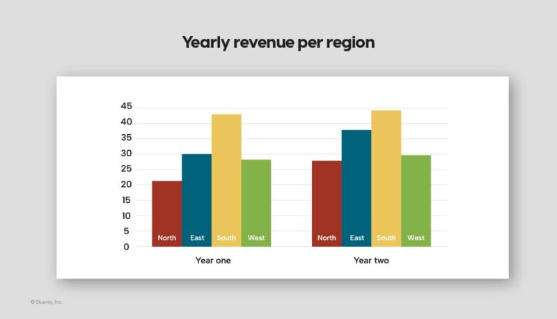
In this data presentation example, it’s much clearer if you simply flatten the chart:
Even if you present your data clearly and accurately, it’s another challenge altogether to make the information stick. Consider using a meaningful visual metaphor to illustrate the scale of your numbers and cement the data in the minds of your audience members. A metaphor is one of several storytelling techniques to bring your data to life, and it can tie your insights to something that your audience already knows and cares about
In this data presentation example, author and activist Michael Pollan showed how much crude oil goes into making a McDonald’s Double Quarter Pounder with Cheese through a striking visual demonstration. He placed glasses on a table and filled them with oil to represent the amount of oil consumed during each stage of the production process.
At the end, he took a taste of the oil to drive home his point. (To add an element of humor, he later revealed his prop “oil” to be chocolate syrup.) Watch the video here:
PopTech 2009: Michael Pollan
Pollan could have shown a chart, but this visual aid was more effective because he gave the audience a tangible visual — one that triggered a visceral response. By answering these five questions as you’re laying out your data, you’ll visualize it in a way that helps people understand and engage with each point in your presentation, document, or deck. As a result, your audience will be more likely to adopt your overall message.
Explore Presenting Data Insights Program to help your team turn data analysis into clear, confident recommendations. And for more expert insight and free resources on this topic, visit The Duarte Guide to Data Storytelling.
A version of this article originally appeared in HBR.
This article was originally published on July 31, 2018. It has been updated in September 2024 for relevancy.