
Guides and tools
Animated charts
Clever animated examples of charts that reveal data over time, for you to download and deconstruct.
View expert examples and learn methods for overlaying visual annotations onto a chart.
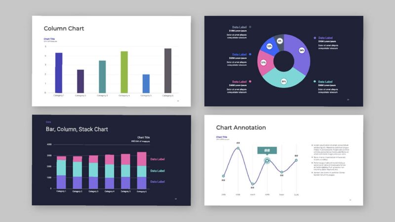
It’s important to choose the best type of chart for communicating insights. Many beautiful and engaging ways to plot charts are available today. Huge databases with stunning visual intelligence can display data that whooshes across screens, unveiling clickable layers of data beneath it. As data sets grow ever more vast, charts are getting more complex and sexy.
This toolkit will introduce you first to the simpler annotation methods — formatting parts of a chart — and grows towards more complicated annotation methods — adding information to a chart. Within each sub-section the complexity of the annotation formatting will increase, as well.
You’ll learn how to: