





Scaling communication with presentation systems

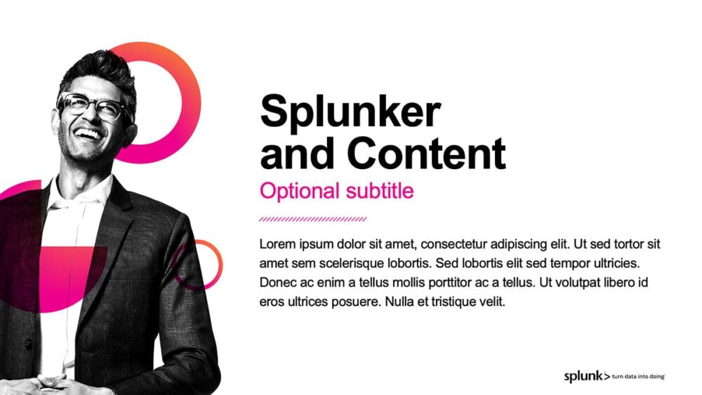
Splunker and Content slide with optional subtitle and Lorem ipsum placeholder text, featuring a smiling man in glasses and business attire next to pink circular design elements and the Splunk logo.
Splunk banner speaker intro slide example

Project background

In most companies, slides are one of many channels of influence. But for disruptors like technology leader Splunk, presentations are the engine of persuasion because slides drive adoption of ideas and products.

Splunk’s new look was a far cry from its dated, 90s-era style. The new visual identity featured bright, vibrant colors combined with rich textures and fun patterns. But using a visual brand that powerful is a bit like driving a Ferrari – if you don’t know what you’re doing, you can get into trouble fast! Aside from marketers and event teams who are expert presenters, most Splunk staff aren’t graphic designers or visual storytellers. They needed a “pit crew” to help everyone in the company get up to speed and stay on track with the brand. That’s where Duarte came in.

Industry

Services

The big challenge

Launching a bold and vibrant new visual identity

As Splunk grew, it needed to revamp its image to better reflect the company’s expanding capabilities. While the rebrand affected everything from ads to signage, Splunk’s new CMO considered slides core to the communication mix because they’re often the first impression people experience. So, her team hired Duarte to spearhead a presentation redesign, from the corporate overview to everyday decks, underpinned by a template that embodied the updated brand in slide form.

Template Introduction slide with orange and magenta gradient background, geometric shapes, and Splunk logo with tagline "turn data into doing" in bottom right.
Illustration of a man in business attire with geometric pink shapes and text reading "Splunker and Content"
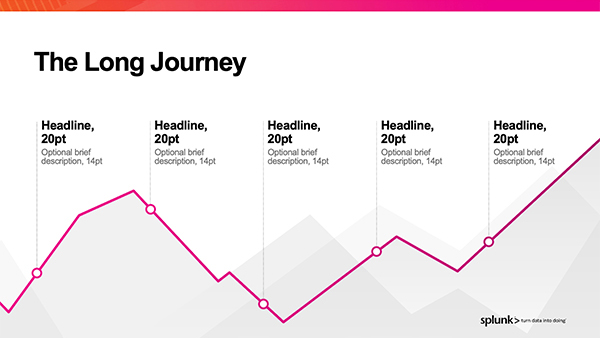
Line chart titled "The Long Journey" showing fluctuating metrics across five sections with pink line and gray shaded area.
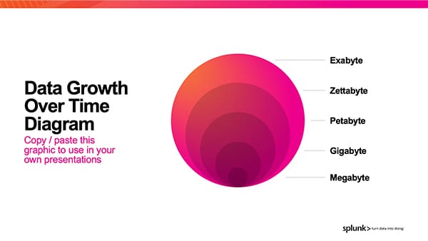
Data Growth Over Time Diagram showing concentric circles in gradient shades of red and pink labeled with data storage units: Exabyte, Zettabyte, Petabyte, Gigabyte, and Megabyte, with text indicating the graphic is available to copy and paste for presentations.
"Photo Grid Layout. Lorem ipsum dolor sit amet..." text on magenta banner overlaid on a grid of black and white photographs showing people collaborating in modern office and creative spaces, attributed to Buttercup Sprinkler.
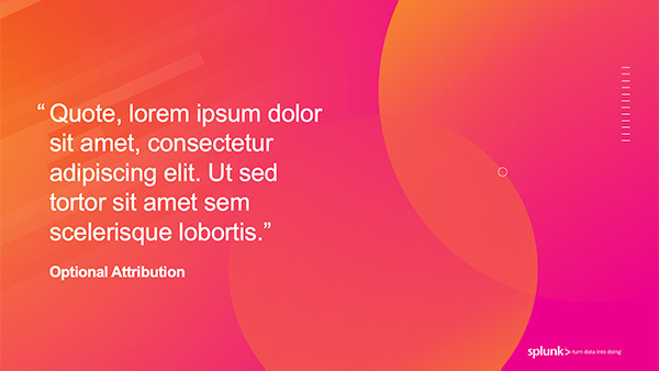
"Quote, lorem ipsum dolor sit amet, consectetur adipiscing elit. Ut sed tortor sit amet sem scelerisque lobortis." Optional Attribution text on gradient orange-to-pink background with abstract curved shapes and Splunk logo.
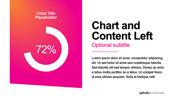
Screenshot of a presentation slide titled "Chart and Content Left" with an optional subtitle, featuring a circular progress chart showing 72% on a gradient orange-to-magenta background on the left, and body text with a Splunk logo on the right.
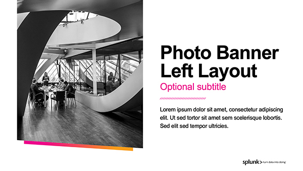
Photo Banner Left Layout template showing a black and white photograph of a modern spiral staircase with people in a bright architectural space, paired with bold text reading "Photo Banner Left Layout" and "Optional subtitle" on the right side.
Half Photo Left Layout slide with optional subtitle, showing a black and white photograph of three people in an office setting around a desk with a computer, alongside text and a colorful diagonal stripe graphic element.

A sample of slides created

1 / 9 5
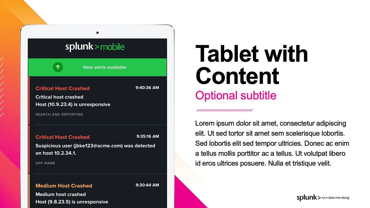
Screenshot of Splunk mobile app showing critical and medium host crash alerts with timestamps and details.
Screenshot of Splunk Enterprise Security dashboard displaying Security Posture metrics including threat activity of 240, authenticated users of 9.4k, cloud activity of 3.
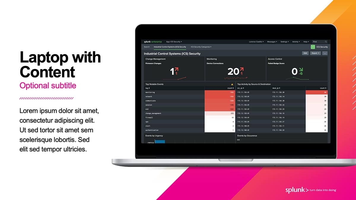
Laptop with Content Optional subtitle displaying Splunk Industrial Control Systems Security dashboard with monitoring metrics and event data.
A Great Divide infographic showing two people in a tug-of-war, with four divide options listed on each side under "Divide Headline," separated by a pink ribbon, representing opposing perspectives or choices.
Diagram showing four statistics with colored callouts: 5%, 56M, 457, and 1.5K, each with brief descriptions below.
World map with four regions highlighted in red and pink, labeled "Highlight" with pointer lines, on gray background.
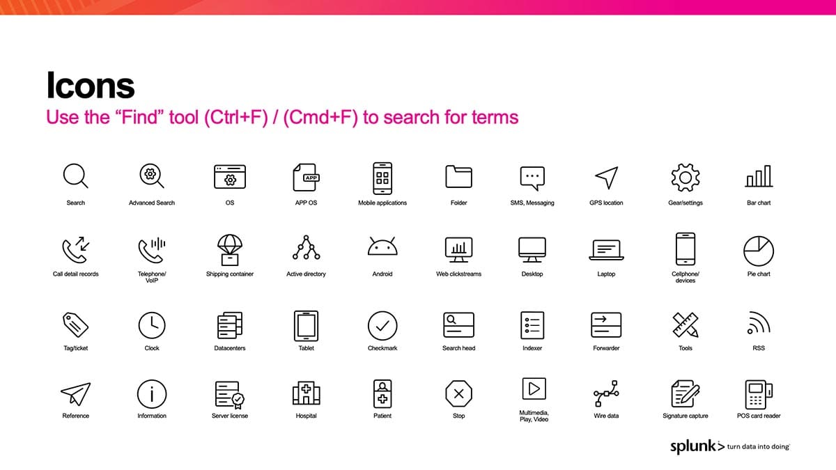
Icon set showing 40 symbols for search, devices, applications, and business functions with labels.
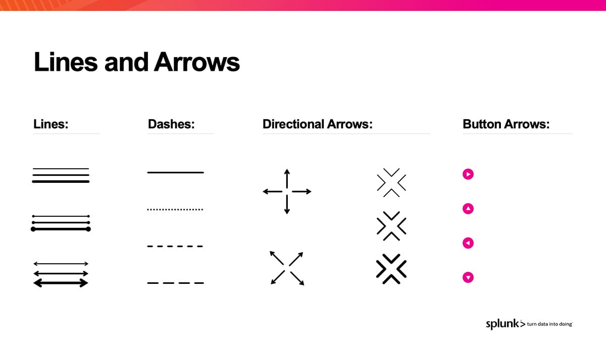
Diagram showing line styles, dashes, directional arrows, and button arrows used in design systems.
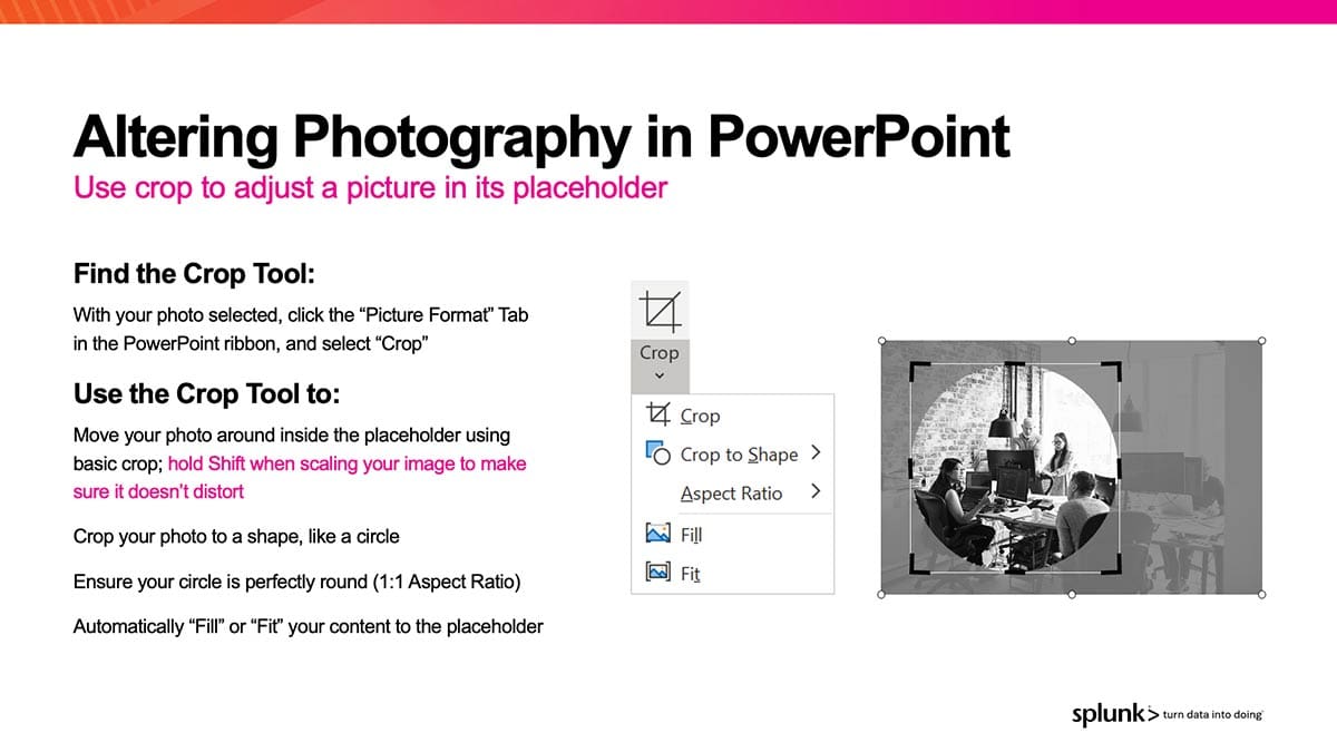
Altering Photography in PowerPoint: Use crop to adjust a picture in its placeholder.
Screenshot of Splunk mobile app showing critical and medium host crash alerts with timestamps and details.
Screenshot of Splunk Enterprise Security dashboard displaying Security Posture metrics including threat activity of 240, authenticated users of 9.4k, cloud activity of 3.
Laptop with Content Optional subtitle displaying Splunk Industrial Control Systems Security dashboard with monitoring metrics and event data.
A Great Divide infographic showing two people in a tug-of-war, with four divide options listed on each side under "Divide Headline," separated by a pink ribbon, representing opposing perspectives or choices.
Diagram showing four statistics with colored callouts: 5%, 56M, 457, and 1.5K, each with brief descriptions below.
World map with four regions highlighted in red and pink, labeled "Highlight" with pointer lines, on gray background.
Icon set showing 40 symbols for search, devices, applications, and business functions with labels.
Diagram showing line styles, dashes, directional arrows, and button arrows used in design systems.
Altering Photography in PowerPoint: Use crop to adjust a picture in its placeholder.

Splunk’s transformative journey with Duarte

Presentation templates are a smart way to empower employees to build on-brand slides. To give Splunk’s staff everything they need to make effective slides, Duarte designed a user-friendly presentation system that was as practical as it was beautiful. The goal? Enable anyone to create consistently effective slides in less time…including teams who were busy prepping for company’s 10th annual user conference in just a few months.

Our process

Before prescribing a solution, we start by diagnosing the problem. So, Duarte began with an extensive audit of Splunk’s slides to learn users’ goals and hopes for the new system, along with discovery sessions to learn the visual language of the new brand. We shared our report of findings and recommendations (in slides, naturally) to get the team’s buy-in before starting design.

Our insights

Studying hundreds of presentations, Duarte designers analyzed Splunk’s most common types of stories and visuals. Soon, we found patterns in the content they struggled to convey clearly. We saw busy charts and densely bulleted lists buried among customer quotes, technology diagrams, product screenshots, and endlessly wordy slides. Visualizing such a wide array of information meant the template needed to offer flexibility while enforcing clarity and consistency in communication.

Our approach

The presentation template system we designed contained a range of layouts mapped to Splunk’s top slide use cases, following timeless design principles from Nancy Duarte’s Slide:ology®. To speed slide creation, we included a toolkit of icons, shapes, imagery, and charts along with a fully transformed version of Splunk’s corporate presentation to show the new template in action. We also recorded an on-demand video to teach employees how to apply the templates to their own slides, on their own time.

The results

“Best New Enterprise Software Marketing of the Year”

Employees raced to adopt the Duarte-designed template system, applying it to sales decks, internal presentations, and everything in between. Thanks to a smart strategy, sharp messaging, and a slick new look, Splunk’s rebrand was awarded “Best New Enterprise Software Marketing of the Year” by Constellation Research. Kudos to Splunkers and their slides!