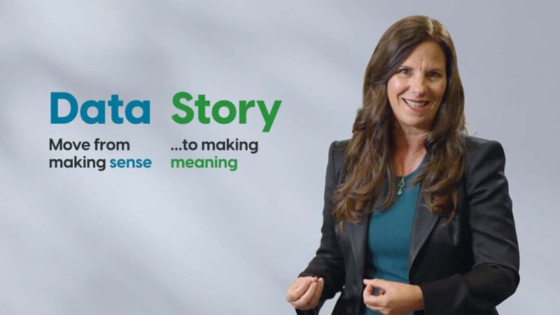
When you’re presenting vital information at work, it’s not enough for the data to make sense. It needs to tell a story. Thankfully, a quick introduction to data storytelling can help leapfrog the obstacles preventing your talks from moving audiences to action.
The Power of Data Storytelling
In a data-saturated landscape, change requires leaders who can understand and communicate data effectively. Impactful presentations use data to propose concrete actions to augment or offset a data point or trend. But it’s not enough to just share statistics and expect your audience to feel inspired to chart a new course. You need to combine your data observations and analysis with a powerful tool to make the numbers hum well after you’ve left the stage.
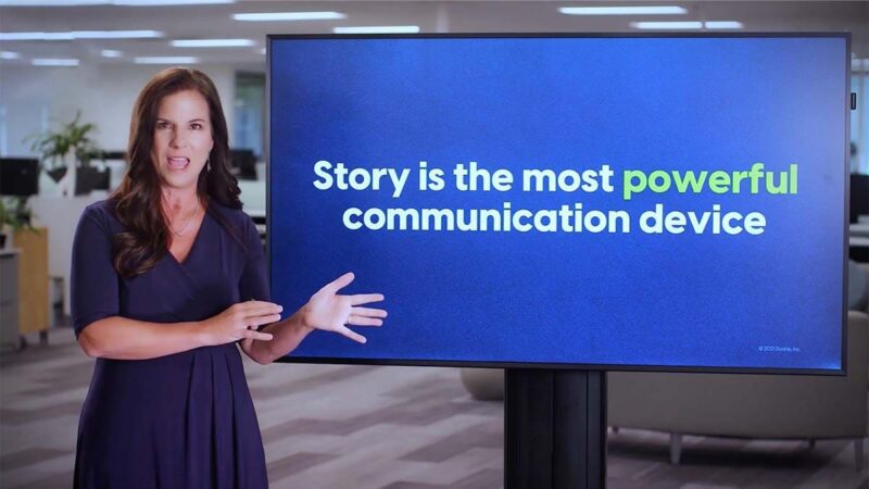
And few are more elegant and effective than storytelling.
Presenting Data Stories with Empathy
We at Duarte believe that by beginning from a place of empathy, data storytellers can give an immersive accounting of the data’s context and relevancy. This framing can ignite audiences to feel the rush and urgency of identifying a problem, seizing an opportunity, or avoiding potential calamities.
That’s because a well-crafted story can sharpen the focus of your data and evoke confidence in your audience to act with purpose. Practiced data communicators offer concise recommendations by using time-honored storytelling techniques to inform and motivate decision-makers.
Meet Our Data Storytelling Experts
Join Kevin Friesen, Director of Academy Training, and Michael Duarte, Senior Director of Learning Strategy, for an introduction to data storytelling to understand the essentials of making data-backed recommendations.
Topics include:
- Moving from exploring data to explaining data
- Mapping data observations and analysis onto a three-act narrative structure to develop your story and drive action
- Using a clear beginning, middle, and end to reach a concise, actionable recommendation
- Illustrating smart data visualization by “thinking like a designer” to highlight context, contrast, and propose a clear path forward
- Combining storytelling and design for nimble responses to data points and trends
- Consolidating your data storytelling abilities to seize emerging opportunities and mitigate potential risks
Telling Data Stories with Duarte
For more information on data storytelling, navigate to our DataStory® Training workshop to learn more about our tenured offerings. Or drop us a line to open a discussion about tailoring bespoke data storytelling services to meet your team’s unique needs.
To access additional talks, free resources, blogs, and expert insights, visit The Duarte Guide to Data Storytelling.