Presentation Principles™
Learn presentation basics
Follow a step-by-step method to write compelling stories, amplify ideas visually, and present with confidence while learning at your own pace.

A good presentation depends, at least partly, on good slide design. Surprisingly, if you want to make great presentation slides, it helps to understand a little bit about the human attention span.
Let’s start with you.
Picture yourself arriving at the last presentation you attended. You were probably one of many people there and could melt into the crowd. You were interested, but preoccupied. There was a phone in your pocket, a to-do list in your head, and your next meal on your mind. The presenter was vulnerable. In the next few moments, she could completely captivate you. Or, she could lose you entirely.
Despite our penchant to try and do several things at once, studies show that humans can’t actually multitask effectively. Instead, we switch our attention rapidly between tasks. In fact, research shows that “multitasking” gets in the way of productivity. It decreases our efficiency by as much as 40%. MIT Neuroscientist Earl Miller explains, “People can’t multitask very well, and when people say they can, they’re deluding themselves … The brain is very good at deluding itself.” Couple that with the most popular problem in our technology-obsessed culture, the ever shrinking attention span and it can seem difficult to connect with a crowd and make an impact.
Good news! (I think.) Despite being distractible, we’re also predictable little creatures. There are several reliable ways to capture and keep our attention. When we work with presentations here at Duarte, we start with storytelling, the ultimate attention grabber. Storytelling should always direct your presentation structure. However, in this article, we focus on using layout and design to grab your audience’s attention. Then, to guide them through the information so your message is broadcast clearly. These lessons apply whether you’re designing PowerPoint slides, Keynote slides, or presenting slides from the back of a napkin. The best part? We’ve developed a tool you can use to test if your slides will hit the mark before you get up in front of a crowd.

Since people can’t multitask, that means that audiences cannot simultaneously read your dense, bullet-riddled slides and listen to you and understand what you mean. Thus, your slide should function more like a billboard than any other media.
We call this “glance media.” The audience should be able to quickly grasp the meaning of the slide before turning back to the presenter. And they should be able to do it in three seconds or less.
We also think it’s helpful to think of your presentation slides as broadcasting information the way a radio transmission does. There’s the signal and then there’s noise. Your signal, or message, is susceptible to interference. This can distort the communication and diminish the audience’s ability to discern meaning and intent.
We developed The Glance Test™ in conjunction with Glenn Hughes at KLA Tencor. It is a litmus test for the readability of slides. It allows you to quantify the effectiveness of slides as a glance media by calculating a signal-to-noise ratio for each slide. In particular, the Glance Test focuses on the singularity of the message, its audience relevance, the clarity of its visual elements, the data presented, the helpfulness of diagrams, its arrangement, and the animation used.
Before you present, you should evaluate each slide in your presentation using the criteria in the Glance Test. If an attribute on the slide takes away from the slide’s clarity, fill in the “noise” bubble. If the attribute helps the meaning come through clearly, fill in the “signal” bubble. Then total up each column — the higher the signal, the clearer the slide. Rework any items that contribute to the noise.
If you want to make good slides for your presentation and ensure you design slides which pass The Glance Test, focus on the following aspects while you are creating them.
Always keep in mind your ultimate goal: making your information easy to digest and understand. Trying to say too much will confuse your audience and cause you to fail the Glance Test from the start. Restraint is crucial:
This might seem obvious, but every presentation should be designed with your audience in mind. However, it gets deeper and more specific than you might anticipate. Every slide, every piece of information you’re presenting should attempt to speak to your audiences’ needs, concerns, and fears. You want to talk to them in a way that builds trust and establishes emotional connections. You want to anticipate their questions and their resistance. Many people take the audience into account on a macro-level, but if you’re committed to your audience, you’ll keep a persona slide at the beginning of your deck as you’re designing your presentation. Then you can refer to it as you’re editing each slide.
When you strip multimedia messages of extraneous elements (like excess text, graphics, and animation) audiences learn from those messages more effectively. So, when you’re designing slides, keep simplicity in mind. Rather than adding elements to a slide for aesthetic purposes, ask yourself if there’s a good reason to put the element on the slide. If you can’t think of a reason, then it doesn’t need to be there.
Stick to one consistent visual style when designing your slide deck. Use the same typeface (or two), the same color palette, and photographs in the same style throughout. This helps ensure that audience members don’t have to do extra work during the presentation to process new or unexpected visual elements. That way they can focus on the meaning of what you are presenting.
When you create your slides, pay special attention to how you arrange elements. Arranging them haphazardly can obscure meaning and confuse the audience. Here are several aspects of arranging you should focus on when designing your slides:
Full disclosure, although we tend to work on developing new presentations here at Duarte, we also work on presentations using building blocks clients already have in place to enhance their everyday presentations.

We use our Glance Test to determine whether slides will be successful or not and to guide the updated design.
The goal of this presentation, which came to Duarte, was to inspire a group of beauty bloggers to feature a new product line on their websites and channels. To achieve this, our client wanted to communicate that there are genetically determined characteristics of skin clarity and that Product X, a scientifically developed organic formula, could improve all those skin conditions in any season.
Their first slides looked like this:

These slides are hard to read! And kind of a bummer. They fail the Glance Test for many reasons including:
Once Duarte took a stab at it, we came up with this:
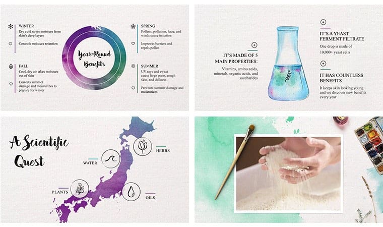
We:
As you can probably tell, this is a completely different presentation. And, the concepts and message are clear and precise. These are the kinds of images and messages that will stop a group of technologically-connected, social-media-happy, utterly-distractible, skincare bloggers in their tracks.
This is what each of your presentations should aim to do: appeal to your audience, communicate simply and clearly, and display presentation slides that transform audiences. It takes a lot more effort to be simple and clear than it does to write down everything you know about a topic. Take it from Woodrow Wilson, who said, “If I am to speak for ten minutes, I need a week for preparation; if fifteen minutes, three days; if half an hour, two days; if an hour, I am ready now.”

Illustrated by Trami Truong