Presentation Principles™
Learn presentation basics
Follow a step-by-step method to write compelling stories, amplify ideas visually, and present with confidence while learning at your own pace.


Since their launch in 1984, TED Talks have become a sort of cultural institution. Today, people turn to TED Talks for a variety of purposes: wisdom, advice, knowledge, and inspiration. It’s now easy for the public to access TED Talks via a variety of platforms and formats—including YouTube videos, Podcast episodes, and blogs containing written transcripts (and much, much more). In addition to being able to view or read the content of speaker’s talks, can also view TED Talk slides from previous talks via online slideshow sharing platforms like SlideShare and AuthorSTREAM.
At Duarte, we take daily inspiration from the TED Talks we hear. We’ve also been lucky enough to work with many of our clients on crafting TED Talk scripts and slideshows that work. From the experiences we’ve had helping people create talks that grip audiences, entertain, convey information, and deliver strong messages, we’ve become keenly aware of a few particular challenges that presenters face when creating visuals for TED Talks.
These challenges include:
In addition to these challenges, we’ve also been able to master some tricks of the trade that consistently help us design TED slides that rise above the noise and connect with audiences.
The following tips, which contain several simple tweaks you can make to your TED presentation slides help ensure you create slides that are clear, aesthetically pleasing, and persuasive—as well as ones that fit within your allotted time and budget. By focusing on making the following small design decisions (or changes), you can make a big impact on the results of your talk.
PowerPoint and Keynote both come with a selection of nice backgrounds to choose from. Used appropriately, they can be the perfect backdrop for your presentation. However, they all share the disadvantage of being available to everyone who uses PowerPoint or Keynote. This means they might be boring—and you want your presentation to be unique.
So, choose a custom background for your TED Talk slides. Some important factors to keep in mind when choosing a custom background include:
So where can you get a custom background? One place to look is stock photo sites, like istockphoto or shutterstock. They have thousands of textures and gradients for sale, many of which would make an excellent background for your presentation. Another option is to simply make one yourself. Our solutions are often a simple gradient. Luckily, creating your own background is easily accomplished with only the tools included in both PowerPoint and Keynote.
We tend to shy away from using a Serif font in any TED presentation slides – especially when they will be projected. (Page 143 in Slide:ology for those of you following along.) Serif fonts (like Times New Roman) have little extra details at the end of letter strokes, like the lines at the bottom of many of the letters you’re reading right now. And they tend to work better when your words will go on for more than one line. The letters in sans-serif fonts (like Helvetica) don’t include those extra details, tend to be bigger and bolder, and generally work better in short bursts, like in headlines, captions, and short phrases. Sans serif fonts tend to be the fonts for most PowerPoint and Keynote presentations.
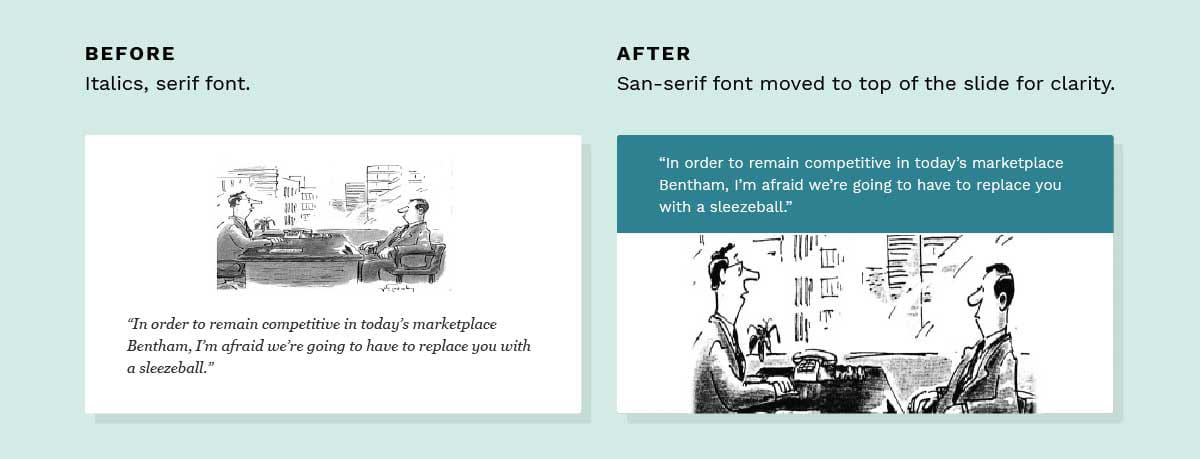
For many presentations, we like to choose simple sans serif fonts like Helvetica. We prefer sans serif fonts for TED slides a few reasons: it’s a relatively standard font, so we wouldn’t have to worry about mix-ups backstage; it’s a clean, easily readable, sans-serif font; and, well… we LOVE Helvetica here at Duarte (check out our logo). You don’t have to use Helvetica specifically for every presentation, but it can be a good fit if you’re looking for the best font for presentation design to communicate a clear, digestible message.
If you’ve watched TED talks online, you’ve probably noticed that their presentations include some subtle transitions and a small animation or two. (Then again, maybe you didn’t). If the presentation was designed well, you probably felt the transitions in the TED Talk slides, but didn’t really notice them. You want your presentation transitions to feel smooth and soft, so choose transitions like soft dissolves and gentle scrolling to enhance the overall experience.

Can you imagine engaging with the speaker’s voice while words are zipping and flying back and forth on the screen? Sadly, you probably can. Instead of focusing on animation, use a small amount of movement to add something subtle to the whole presentation.
While animations and transitions can help, if you feel your animations don’t add something positive to your presentation, you’re probably better off taking them out. It’s okay to have TED presentation slides that don’t use animation or transitions at all.
Presenters often include many ideas on one slide, doing their best to be efficient with their slide real estate. An honorable gesture, but totally unnecessary in a digital world.
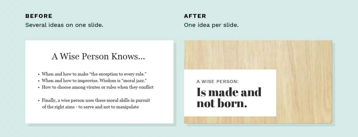
During a live presentation, visuals exist in time as well as space. The audience doesn’t need to stare at the same four points while the speaker weaves his story around each of them. So, make sure each of your TED presentation slides only focuses on one bullet point or main idea. This lets the audience absorb them one at a time and (once again) highlights the speaker’s voice as the most important part of the experience.
I heard a speaker at a recent conference (not TED) give instructions to the audience on inserting images into their presentations. “When you look for images on Google,” he said, “try to find the highest quality version”. I could hear a tiny cry of pain from designers and photographers all over the world.
Folks, Google Image Search is not an appropriate tool for building professional presentations. Finding the “perfect” image on Google gives you no rights whatsoever to use it in your presentation. You need to contact the owner of the image and get permission, by paying for licensing rights. Or asking really nicely.
(Note: If you do get permission to use an image, you want to make it look great for its on-screen debut. If you have Photoshop, you can do it yourself. If not, why not try out an online photo retouching service? Do everything you can to make sure the image enhances your story rather than detracts from it).
If you want to go straight to a resource that makes images available for TED Talk slides, check out a site like Pixabay, which offers images that can be used and reused commercially for free—without needing to pay for any special license. You can also check out a resource like PresentationPro, which offers a PowerPoint Graphics Pack for purchase and includes many royalty-free graphics and images that you can use throughout your TED presentation slides.
If you’ve followed these tweaks to edit your TED talk presentation, you probably found that the “makeover” to your TED Talk slides was pretty simple and didn’t take too much time. Luckily, however, even these small improvements will make a dramatic impact on the end result. Keep these five tips in mind the next time you need to “clean up” your TED presentation slides. They’ll save you time and energy in the long run—and make a big difference in the impact of the talk.